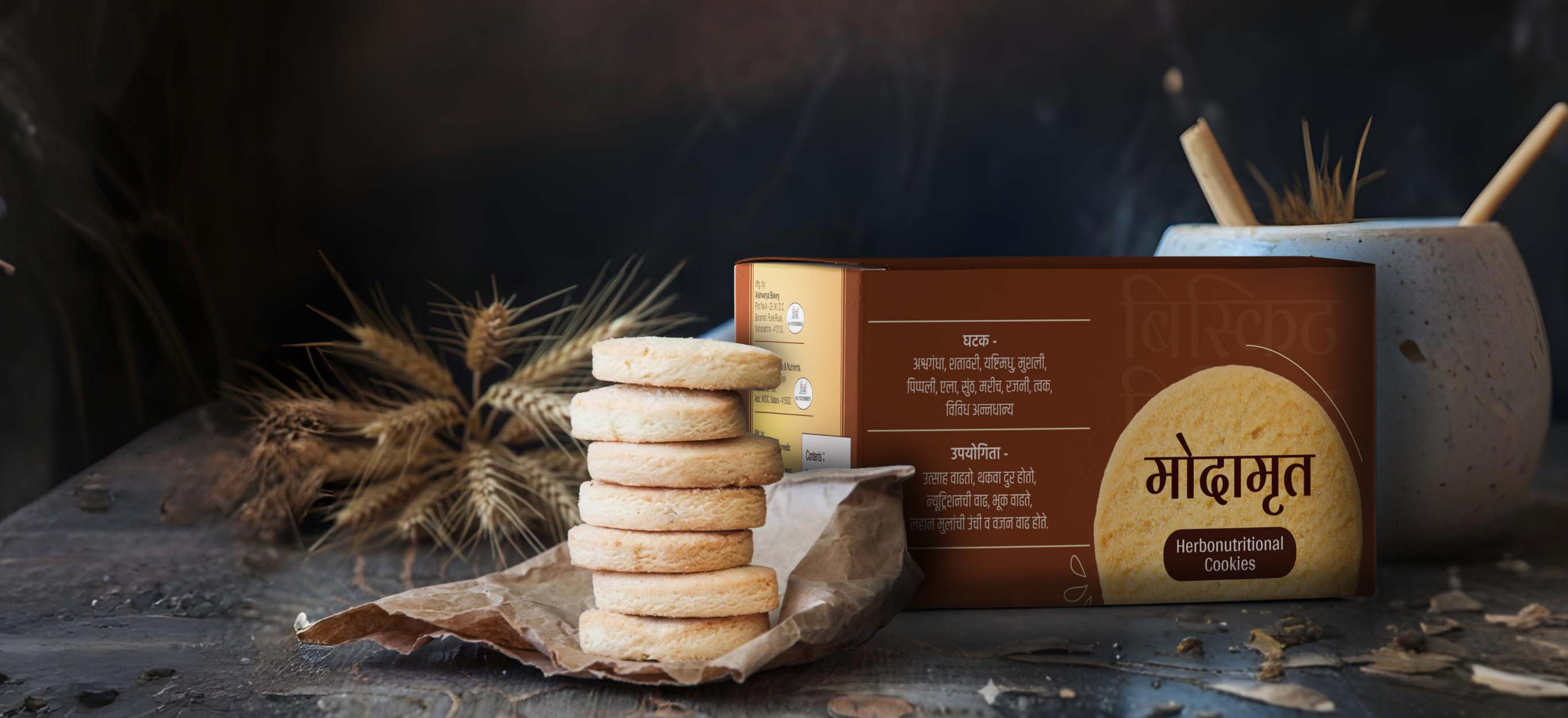
Modamrut is a multigrain ayurvedic cookie brand created for children. The challenge was to design packaging that clearly communicated health, nutrition, and ayurvedic goodness—while still appealing to kids.
Since the product came in two forms, cookies and milk-mix powder, the packaging needed to maintain consistency while highlighting their unique purpose.
We crafted a design language rooted in natural, earthy cues to emphasise Modamrut’s ayurvedic foundation.
Even though the flavour was chocolate, we consciously avoided overly chocolatey colours or visuals to prevent any misleading perception.
Instead, the design balances wholesome ingredients, soft tones, and kid-friendly cues—ensuring it still felt like a product meant for children, without compromising on the brand’s health-first positioning.
A packaging system that instantly communicates trust, purity, and nourishment, yet remains visually engaging for kids.
The final look stands out on shelves with a strong ayurvedic identity, while parents feel assured and children feel attracted to the product.
